Building a Composite Plate in Photoshop
Creating publishable composite image plates is an important skill for any scientific researcher to master. Photoshop contains all the tools neccessary to build these plates and also has the ability to save the final plate in multiple formats, color spaces, and resolutions, to match any publishers demands. Many researchers build plates using Powerpoint, which in my opinion is a bad idea. Powerpoint provides an easy, user friendly interface for the plate construction but few publishers will accept Powerpoint files for printing and converting a Powerpoint file into a usable format (ie. .tif or .eps) at an acceptable resolution is often difficult. Spend the time to learn Photoshop (this example) or Adobe Pagemaker for compiling plates and you will save yourself many headaches in the future.
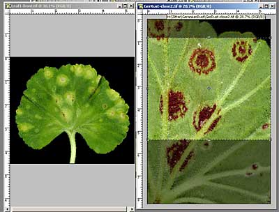
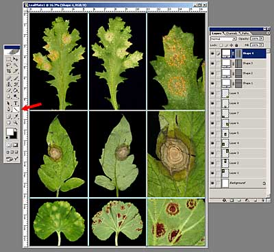
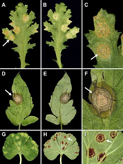
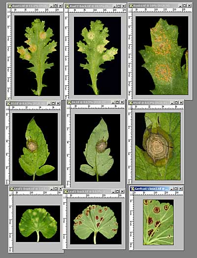 I like to begin making a plate by opening, in Photoshop, all the images I hope to include and placing them in roughly the position and size they will be in the final composite. This gives you an idea of the final layout and will allow you to make decisions on exactly which pictures to use. In this example, I have made a grid of 3 rows with 3 columns of pictures per row. Each row consists of a front, back, and magnified view of a leaf with lesions. If you have multiple versions of a picture, I would suggest working with the largest, uncompressed version of that picture (see Image File Formats). Don't start with an image that has already been reduced in size and compressed, such as one prepared for a Powerpoint presentation (see Sizing Digital Images for Powerpoint).
Consult the Instructions to Authors for your intended publication and determine what column width you wish the final figure to fill. In this situation, to see detail in the individual images, the plate should probably be full page width. However the journal may have a 3 column format, which would allow a 2 column figure with caption running down the 3rd column. I tend to design the plate for the largest possible publication size, and then reduce the size later if neccessary.
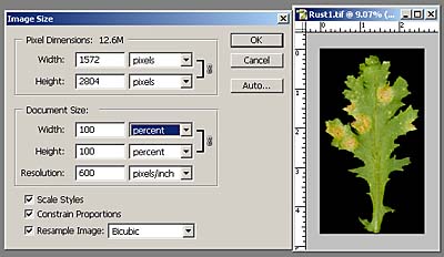 Since each of these images might have come from different sources (your 6 Mpixel camera, someone elses 3 Mpixel camera, slide scan, etc.) they should all be made the same resolution at the start. Most publishers require 300 pixel/inch resolution at the publication size and many request 600ppi if the image contains symbols or text, so I usually start at 600 ppi and reduce the size later if possible. For each picture, open the Image Size box (Image/Image Size), set the ppi to 600 (or 300 if you know that will suffice) and set the Width and Height to 100 percent. This will not change the actual dimensions of any img but will make the images a uniform ppi.
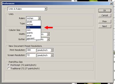 At this point it's probably a good idea to go metric if you aren't already. I always turn on Rulers (View/Rulers) so each image has it's own built in scale. Most publications list their page widths in metric units so go to Edit/Preferences/Units and Rulers and convert to metric (either cm or mm - red arrow). Now all measurements on the rulers and in Image Size will be metric.
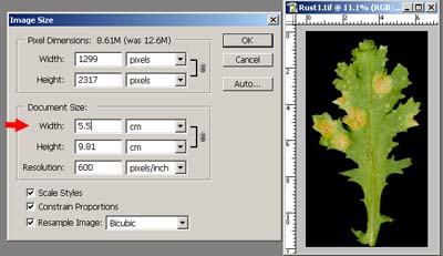 Now, determine what size each print should be. In this situation, I'm designing the plate to be 16.5 cm wide and no more than 24 cm in height (full page format). Since there will be 3 equal width columns, each column should be 5.5 cm wide. Use the Image Size box to set each image to this width at 600 ppi (red arrow).
In a best case scenario, you will be making the images smaller, not larger to meet the criteria. In theory you should not increase an images size but in the real world you can (within limits). Be sure to sharpen each image using Unsharp Mask after changing its size.
 This group of 9 images should fit well into a rectangular plate except for one. In the bottom row you can see that 2 of the images are roughly square, while the 3rd is a vertical rectangle. When they are converted to 5.5 cm wide, the last image is much taller than the other 2. To get this image to fit with the others it must be cropped in height. Use the Crop Tool in the tool bar and the rulers along the side of the image to crop to the proper size.
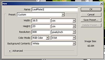 Now we're ready to put it all together. Start by opening a new canvas (File/New) that is roughly the size and resolution of the final plate. In this case we know the width will be 16.5 cm and a quick look at the heights of the 3 rows adds up to about 23 cm in height. This size and resolution adds up to a large file size (60.6 Mb) so you need a lot of RAM to work on these kind of plates.
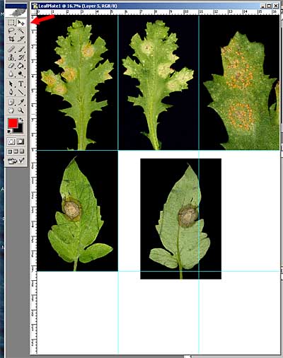 Using the Move Tool (red arrow) drag the individual images into the new canvas to their intended locations. After each image is added, I drag a guide line from the side rulers to mark its edges and help align the following images. Click View/Snap and the guides will snap to the edges of the active layer. By also clicking View/Snap To/Guides the following images will snap to the existing guides.
 When all the images have been positioned, crop any unused area of the canvas. Leave the guides in place and they can be used to position dividing lines between the images. To draw dividing lines, choose the Line Tool (red arrow), and make white the forground color. Choose an appropriate Line Weight in the menu bar on the top of the desktop (not shown). Click and drag to form a line. If you start the line on a guide (and have View/Snap clicked) the line will stick to the guide. Note that each line drawn becomes it's own layer so if any mistakes are made, it can be discarded without ruining anything else. Make sure that the line layers are at the top of the stack of layers, or they will not be visible under the images. If they are below the images, click and drag the line layers to the top of the stack. When all the lines are drawn, click View/Clear Guides and see how it looks.
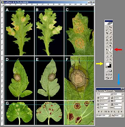 To add labels and text to the plate choose the Text Tool (red arrow) in the tool bar. In this case the labels should be white, so make white the forground color (yellow arrow). Using the Text Dialog Box (blue arrow) choose font, size, and weight for the text. If the Text Dialog Box is not on the desktop go to Window/Character to open it. Again, after each label is added, I pull a guide from the rulers to mark its position. Subsequent labels can be placed easily if View/Snap is clicked. It's always best to place each label in the same corner of each image, in this case the upper left.
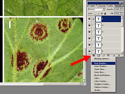 In this situation, labels A-H fell on black background areas and could be easily seen. Label I however gets a little lost in the leaf. To make it stand out better, let's add a drop shadow. To do this, click on the I text layer in the Layers palette and then click on the f symbol at the bottom of the Layers palette (red arrow). From the drop down menu choose Drop Shadow.
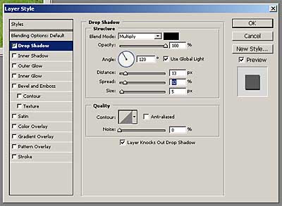 This Layer Styles dialog box will open. You can change the Opacity, Angle, Distance, Spread, Size, and Quality of the drop shadow until it looks good.
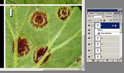 Now the drop shadow helps the label I stand out against the leaf backdrop. In the Layers palette you can see the Effects sublayer and it can be further modified or deleted without harming the Text layer above it. A drop shadow or other Layer Style can be added to any object including text, lines, arrows, shapes, etc..
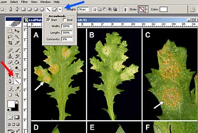 To place an arrow on the plate, choose the Line Tool (red arrow) and the forground color (white in this case). In the overhead menu bar click the Arrowhead button (blue arrow). Numerous options are available so experiment until you get a proper arrow. Drop shadows and other effects can be added as in the above example.
When all the labels and arrow are added, save this layered version as a Photoshop File (.psd). If future changes need to be made, this .psd file will be invaluable for tweaking. Flatten the image (Layer/Flatten Image) and save as a Tiff (.tif). This is the file that the publisher will use to print the final plate. Often publishers will request CMYK files instead of the normal RGB. To convert the image to CMYK, go to Image/Mode and choose CMYK. Slight color changes may occur, so you might want to tweak the color before sending off to the publisher.
This example is a very simple gridded plate design. With these techniques and careful planning you can build much more complex composites for any publishing need.